Iron Man PFPs work because Tony Stark's armor has always been a mask that says more about identity than it hides. Since debuting in Tales of Suspense #39 in 1963, the character has embodied a very online idea decades before the internet existed: you build the version of yourself you want the world to see. A glowing arc reactor, a red-and-gold shell, a face with no expression to give away: that is the exact language profile pictures speak. His design stays legible even in a tiny circle, and decades of redesigns mean there is a version for almost any tone.
Classic Red-Gold Armor PFP
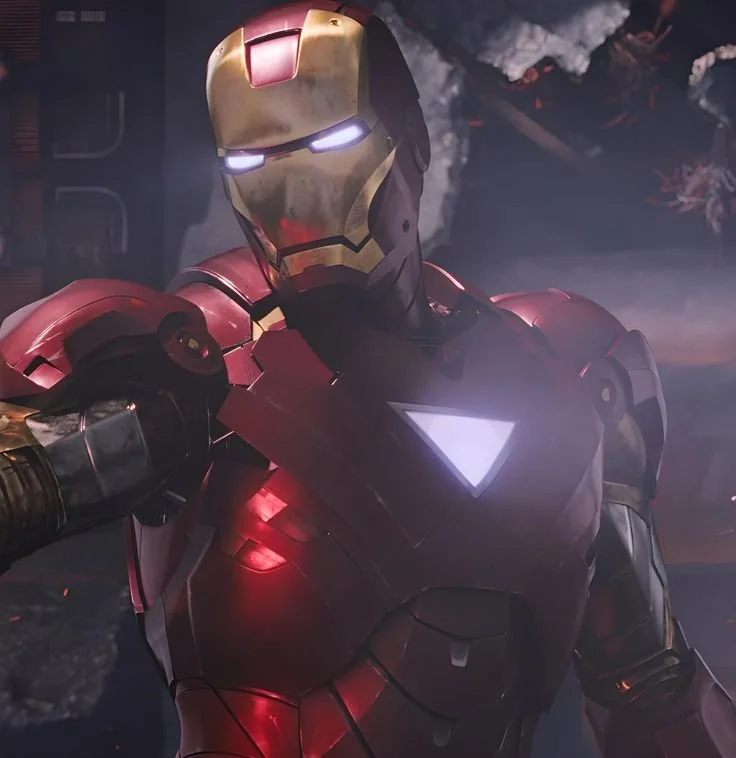
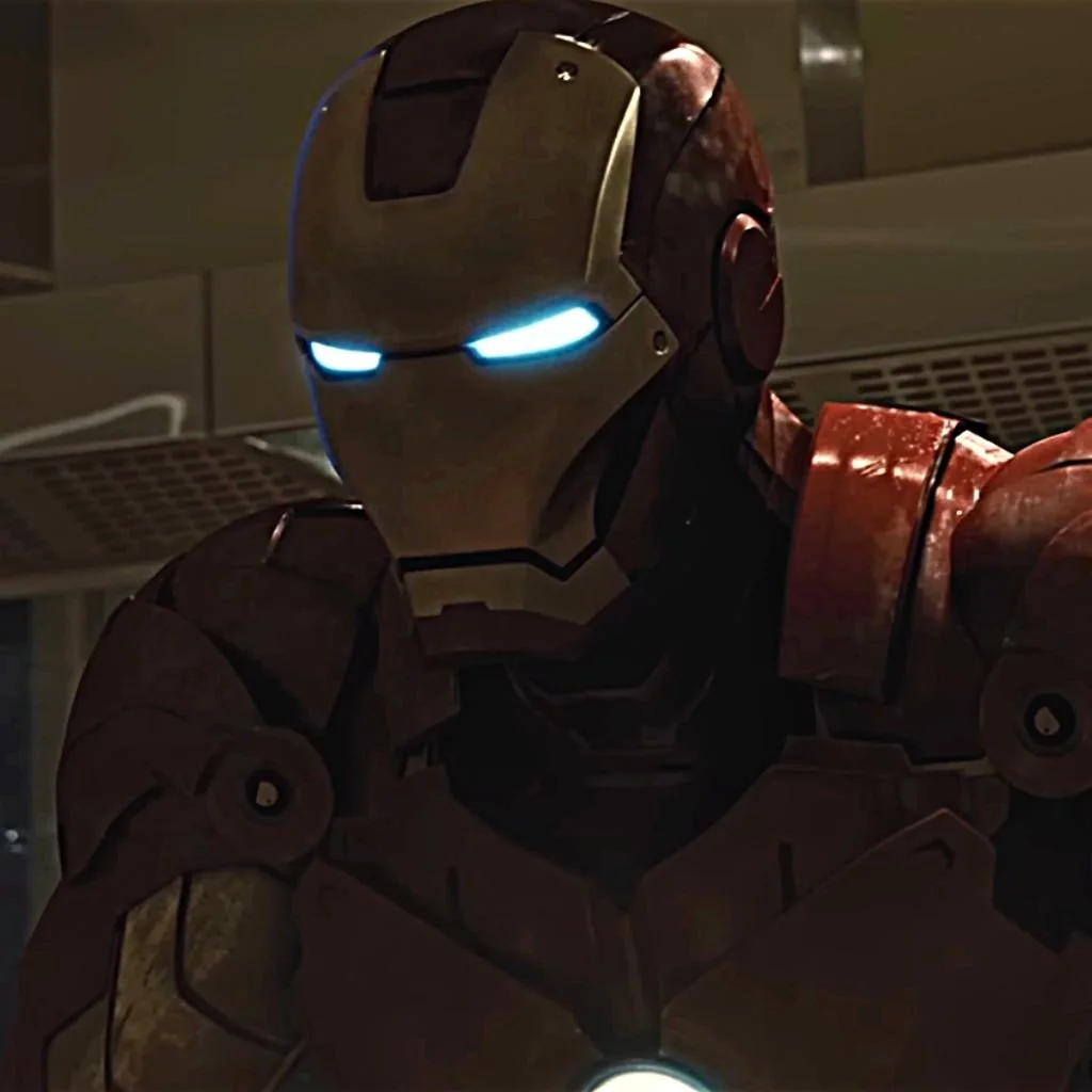
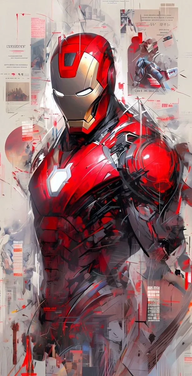
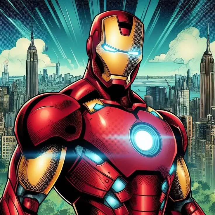
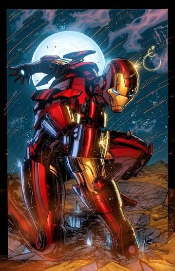
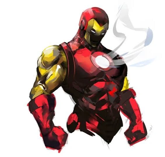
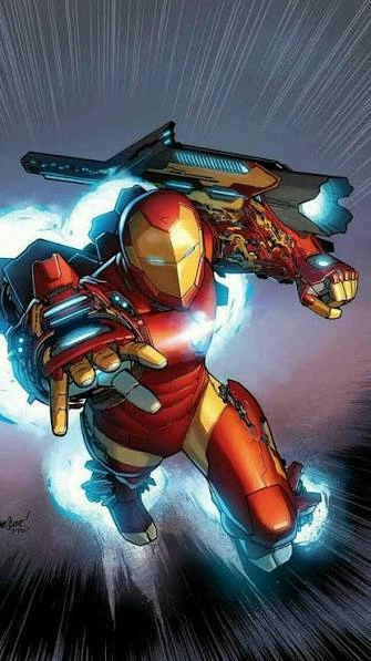
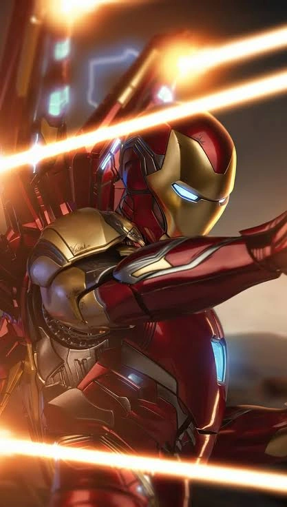
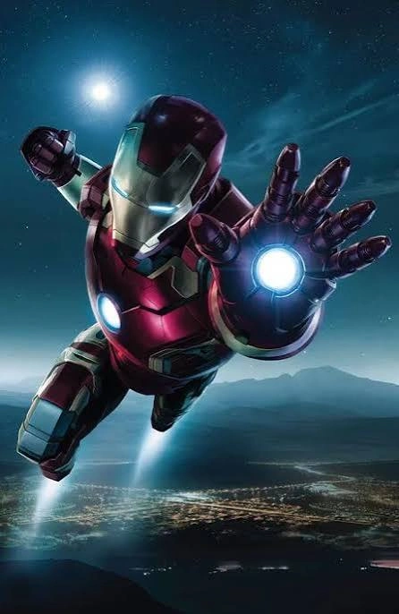
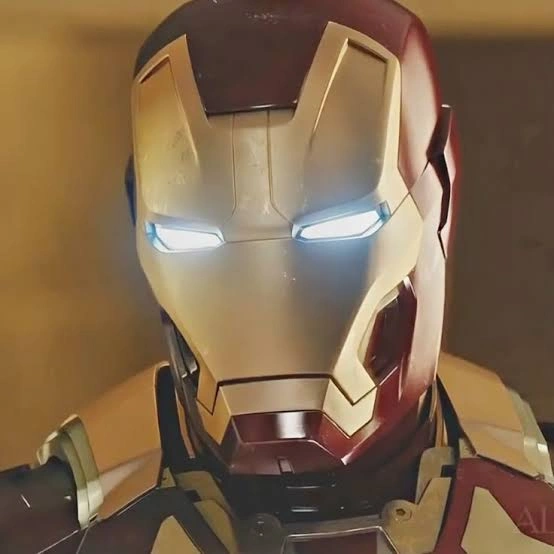
The red-and-gold color scheme, codified through the Mark III-style armor popularized in the early 1980s, is the version most people picture when they hear Iron Man. It is built around a two-tone palette: a deep candy-apple red base with gold detailing on the chest and forearms with matching boots. As a PFP, this contrast does a lot of visual work: red and gold sit far enough apart on the color wheel that the armor pops against nearly any background without extra editing. The faceplate's narrow triangular eye slits give off calm authority rather than aggression, which is why this version reads as confident more than intimidating. Lighting tends to favor a single source hitting the chest-mounted arc reactor, letting that circular glow act as a natural focal point even in a tiny frame.

Hulkbuster Armor PFP
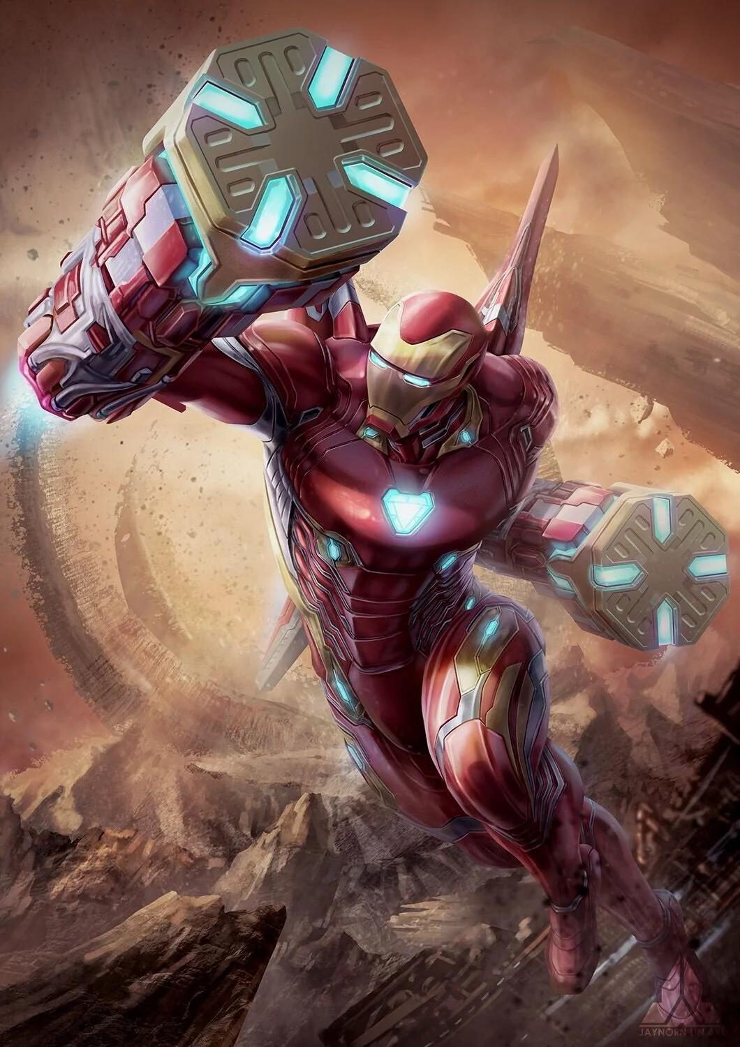
The Hulkbuster, massive and boxy and built specifically to physically overpower the Hulk, is the version fans reach for when they want scale rather than sleekness. Where the classic armor is sleek, the Hulkbuster is deliberately oversized: thick plated forearms, a wider stance, and a chest unit that dwarfs the rest of the design. As a PFP it reads as raw power rather than elegance. The palette leans industrial: muted reds and grays instead of glossy red-gold, with more visible mechanical seams and rivets. That grittier finish photographs well under harsher, directional lighting, since the added texture and shadow depth enhance the sense of bulk. Cropping in tight on the head and shoulders is usually necessary, since the full silhouette is too wide to read clearly at small sizes.

Stealth Armor PFP
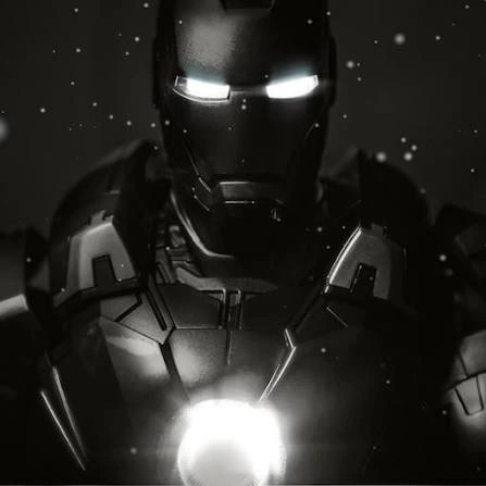
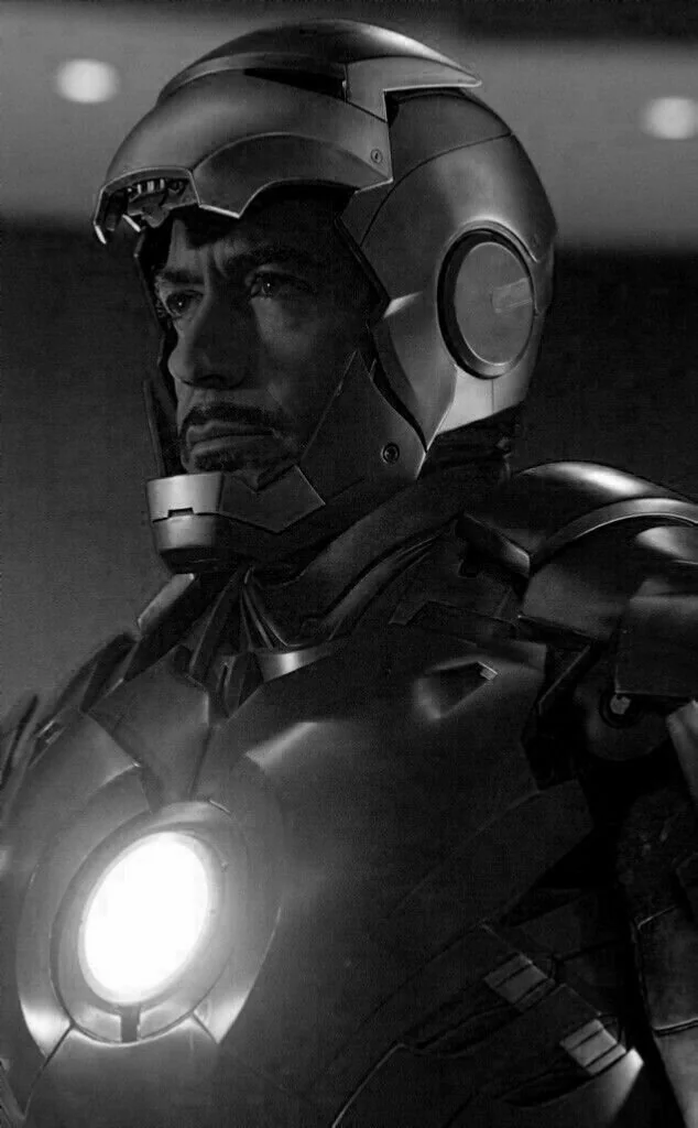
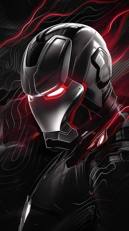
The matte black stealth armor strips away the loud red and gold in favor of a low-visibility palette: charcoal black with faint violet or dark red underlighting along the same panel lines the classic suit uses. It is an armor meant to blend in rather than announce itself, and that concept translates into a PFP that reads as understated rather than showy. Because the palette is so dark, lighting becomes the entire story. A single rim light or the arc reactor's glow against near-total blackness creates strong contrast without needing bright colors, which is why this version performs well for users who want their account to feel moody or minimal. Backgrounds should stay dark too: a black backdrop lets the faint reactor glow become the only real point of visual interest.

Superior Iron Man PFP
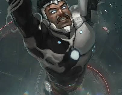
Introduced during the Superior Iron Man storyline, this white-and-gold redesign swaps the traditional red base entirely, giving the armor a sleeker, almost predatory silhouette with a more angular jawline than prior suits. The story behind it, Tony operating under a morally compromised version of himself, gives the design an edge that fans who know the arc read into the PFP itself: it looks like Iron Man, but colder. The white base behaves differently under lighting than any red-gold version. Instead of relying on contrast between suit and background, the white plating reflects ambient light, so soft, even lighting produces the cleanest results. Gold trim stays as the accent, playing the same focal-point role the arc reactor plays elsewhere.

Iron Man PFP Aesthetic
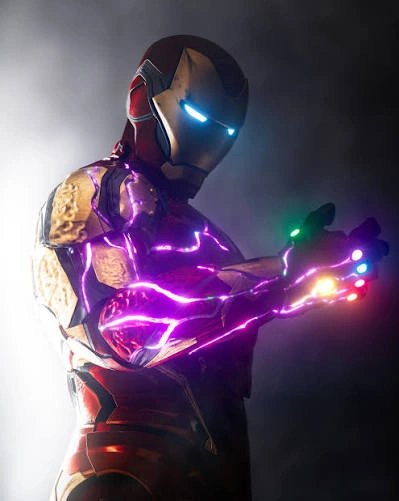
Iron Man's softer edits play on the glow: soft light, a gleaming red-and-gold suit, and dreamy city backgrounds. The balance between warm gold and red catches attention while staying visually pleasing. Minimal edits with subtle shadows or neon highlights suit Discord, Instagram, and Pinterest — a calm but confident look for creative profiles.

Iron Man PFP Marvel
Classic Marvel art is Iron Man as the comics and films drew him: the red-and-gold armor, the arc reactor glowing in his chest, and the confidence of a hero who built his own powers. Official-style artwork feels timeless on gaming profiles and social media. From battle-ready poses to heroic close-ups, every image reflects strength and leadership.

Iron Man PFP Anime
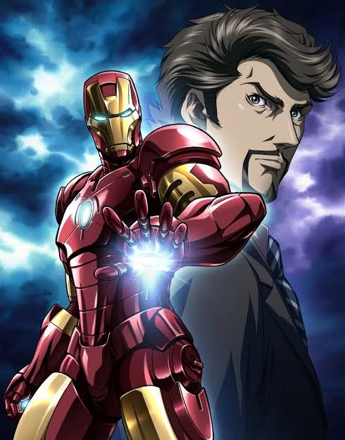
Anime Iron Man redraws the armor with sharp eyes, dramatic light, and bold effects. The futuristic style stays intact, but the expressions add a personality the movies rarely show. These blend well with anime Discord communities, TikTok, and Pinterest collections where creative edits are popular — energetic, emotional, and still unmistakably Iron Man.

Iron Man PFP Cool
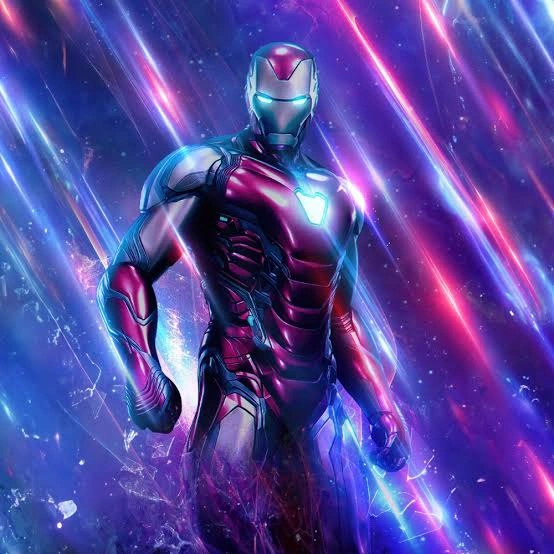
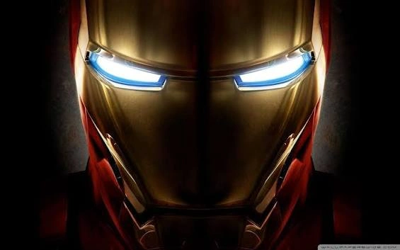
Cool Iron Man is about confidence, not action: a steady stance, glowing eyes, and sleek armor against a dark background. The suit's reflections create eye-catching contrast that works especially well on gaming profiles and Instagram. The style feels modern and bold with a clean finish — the billionaire genius, unbothered.

Iron Man PFP Avengers
Avengers group art puts Iron Man beside his team: Captain America, Thor, Hulk, and the rest of Earth's Mightiest Heroes. The images show loyalty and leadership through cinematic moments — the team assembled, ready for the fight. These suit Marvel fans who want to represent the whole universe instead of a single character.

Iron Man PFP Cute
Cute Iron Man shrinks the armor down: chibi proportions, playful expressions, and rounded designs. The arc reactor stays, the faceplate smiles, and the whole image feels charming without losing the superhero identity. Pastel backgrounds and smiling faces suit Pinterest boards and casual messaging profiles — the hero, as a friend.
Iron Man PFP Funny
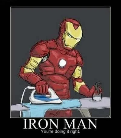
Funny Iron Man edits use the character's ego: meme reactions, exaggerated expressions, and the moments where Tony Stark's confidence becomes the joke. These are popular on Discord servers, where personality matters as much as appearance. A witty Iron Man avatar sets the tone before you type a word.

Iron Man PFP Angry
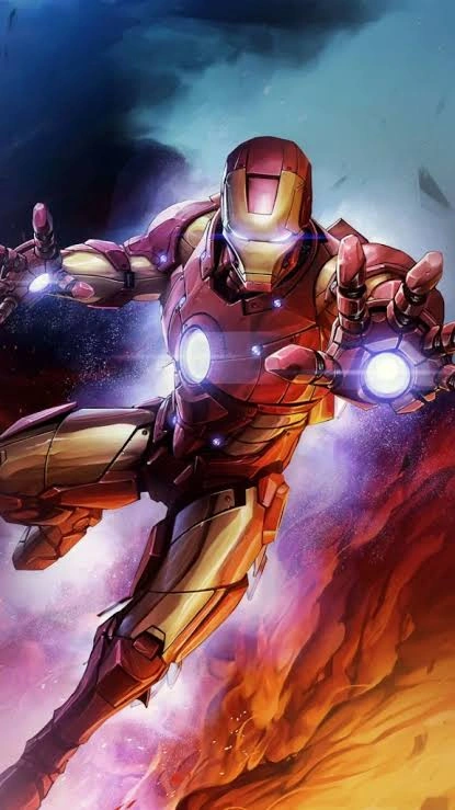
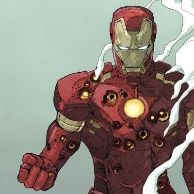
Angry Iron Man is the hero pushed too far: intense battle scenes, dramatic light, and the armor glowing under pressure. Every image feels filled with unstoppable energy. These suit competitive gaming profiles, where confidence and intensity create a stronger identity — the suit, at full power.
Iron Man PFP Sad
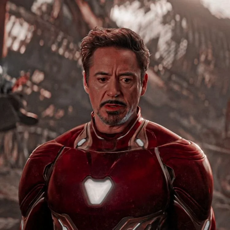
Sad Iron Man shows the man inside the armor: gentle light, reflective poses, and cinematic backgrounds. These images resonate with fans who appreciate the character's story — the sacrifices, the losses, the weight of being the one who builds the solution. A softer profile look that stays elegant and expressive.

Iron Man PFP Dark
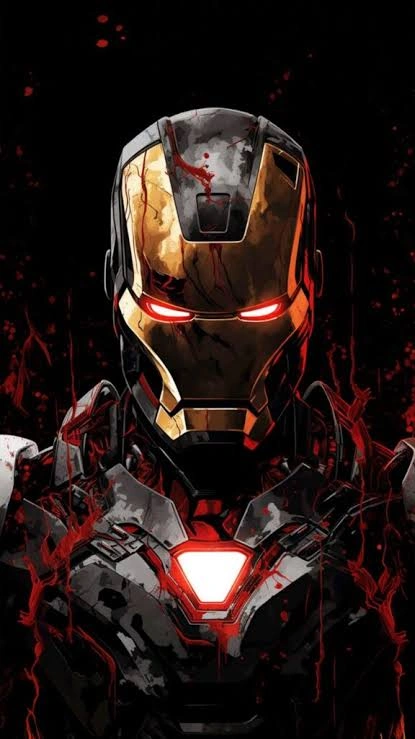
Dark Iron Man edits are the arc reactor against near-total black: the glow becomes the whole image. Minimal backgrounds let the light carry the portrait, and the contrast feels mysterious and cinematic. These suit profiles that want intensity and drama without clutter — one glow, one hero, nothing else.
More Iron Man PFPs
Browse the full gallery below — tap any image to view it full size, then save it as your profile picture.


































Frequently Asked Questions
Which Iron Man armor makes the best PFP?
The classic red-gold suit is the safest pick: instantly recognizable with strong color contrast. Hulkbuster brings raw power, stealth armor suits moody minimal profiles, and Superior white-gold fits morally gray, antihero framing.
What makes the classic red-gold armor so readable as an avatar?
The two-tone palette pops against almost any background, the triangular eye slits read clearly small, and the arc reactor gives the eye a natural focal point.
Are stealth armor PFPs popular?
Yes, in aesthetic and dark-mode-leaning communities. The near-black palette with faint reactor glow creates an understated, moody profile.
Do cute Iron Man PFPs work?
They do for casual spaces. Chibi designs, pastel backgrounds, and playful expressions keep the superhero identity while feeling friendly and approachable.
What is the Superior Iron Man design?
A white-and-gold redesign from the Superior Iron Man storyline, where Tony operates as a morally compromised version of himself. Fans read that colder edge into the PFP.