Red is the loudest color you can put in a profile picture, and that is the point. A red avatar stands out in a server list, a comment thread, or a feed full of muted tones. This page covers the full range: deep crimson edits, neon red anime art, dark red portraits, and softer red-and-pink looks. The color stays the same, but the mood changes completely with the shade and the lighting.
Unlike character-based PFPs tied to one fandom, red aesthetic designs work across communities. Anime edits and neon artwork sit comfortably under the same color umbrella as dark-themed portraits, and cute illustrations borrow the same red too — so one avatar carries you from Discord servers to gaming lobbies.
Aesthetic Red PFP
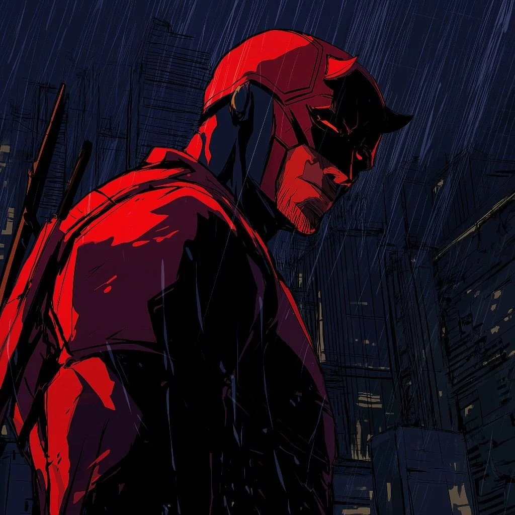
A red look works when the palette stays controlled. Deep crimson, burgundy, and a touch of neon red read as one mood instead of a clash, especially against black or charcoal. Grain and soft light keep the image from feeling flat, while a single bright detail — glowing eyes, a red flower, a neon sign — gives the eye somewhere to land. Keep the background dark so the red has room to breathe.

Typical subjects range from glowing cityscapes and rainy neon streets to abstract backgrounds and anime-inspired art, plus the occasional cinematic portrait. Editors lean on soft lighting and film grain, layered with careful color grading and a slight blur, to give the image a finished, gallery-like feel. The appeal is simple: a strong red palette draws the eye without looking busy, and it keeps its sophistication whether it sits on a gaming account or a social media profile.
Anime Red PFP
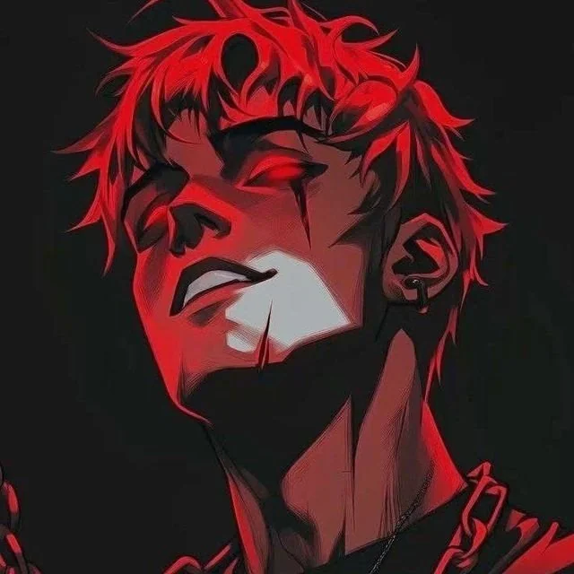
Anime and red are a natural match because anime already uses the color for intensity. Crimson lighting, glowing eyes, and scarlet backgrounds turn a familiar character into a sharper, more dramatic image. The strongest edits keep the face as the focal point and let the red sit behind it. That way the character stays readable, and the color does the emotional work.

Editors build these with deep red shadows and vivid highlights, framed cinematically. Battle scenes and brooding character portraits dominate this style, often shot as tight dramatic close-ups and blended with modern editing techniques for a one-of-a-kind avatar. Whether the image feels calm or electric, the red makes the scene hit harder and keeps the thumbnail readable at small sizes.
Dark Red PFP
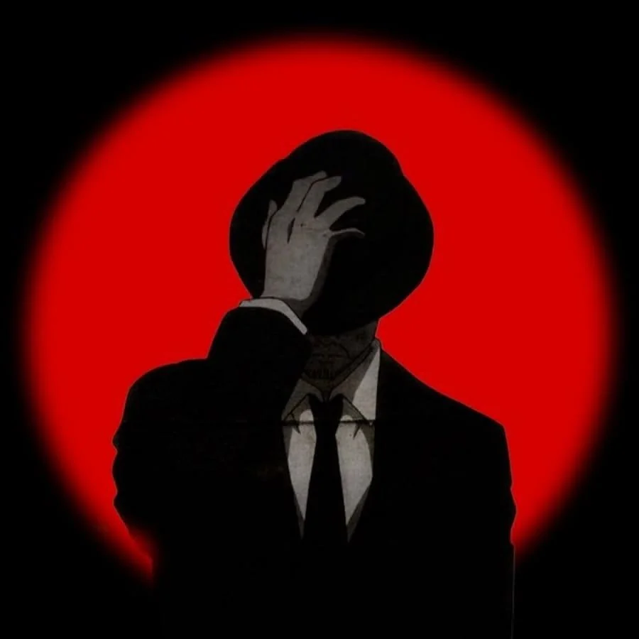
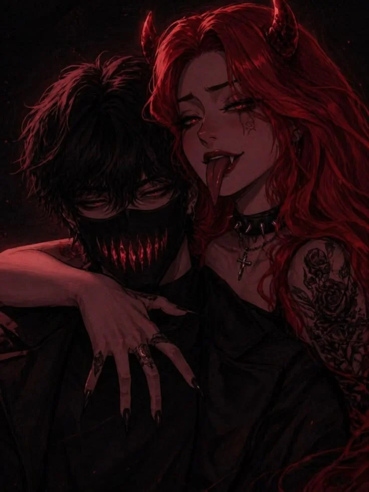
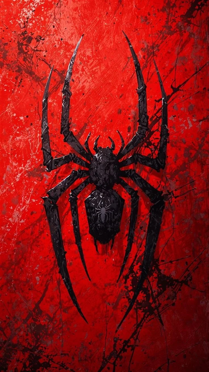
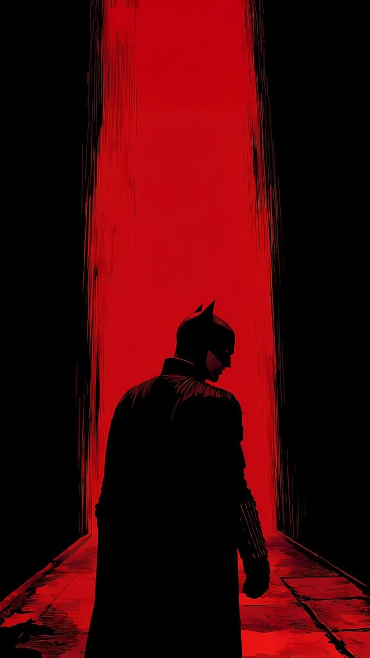
Dark red trades brightness for weight. Black backgrounds set off deep crimson highlights, so the image feels mature and a little intimidating without getting busy. The look suits gaming profiles and late-night servers, where dark themes are the norm. Keep the face lit and the edges simple, and the avatar stays clear even at thumbnail size.

Typical edits pair glowing eyes in shadow with drifting fog. Moonlit scenes and selective red lighting round out the style. Heavy contrast and careful color grading push the red elements forward while the darkness recedes. Gamers and Discord users drawn to darker aesthetics pick this style to project confidence and individuality — black and red remains one of the most iconic combinations in online visual culture.
Cool Red PFP
Cool red is about polish: sharp framing, dramatic light, and a layout that looks intentional at a glance. The red should hit hard in one place — a jacket, a glow, a background wash — while the rest of the image stays restrained. That contrast is what makes the avatar memorable instead of just loud. It works well on TikTok and Discord, where first impressions happen fast.

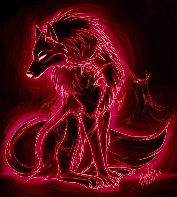
This style borrows from cyberpunk and futuristic design: neon signs and glowing effects, with motion blur and particle textures adding motion, plus sleek typography. Red highlights are usually grounded with black or gray for balance, and cinematic grading ties it together. Because these designs don't depend on any single fandom, they travel well across gaming communities and social platforms, fitting creative professional profiles too.
Cute Red PFP
Red has a softer side when it shares the frame with pastel tones. Warm reds next to soft pink, plus small hearts or flowers, turn an intense color into something welcoming. The trick is balance: let the red set the energy, and let the lighter colors soften it. These suit friendly profiles and casual chats, where the avatar should feel warm rather than fierce.

Anime characters and cartoon art show up often here, alongside chibi illustrations wrapped in soft lighting and smooth gradients, with decorative overlays on top. Pink and white accents take the edge off the red, keeping the whole image gentle. These are popular with users who want a warm, friendly online identity that still carries the energy of a bold color.
More Aesthetic Red PFPs
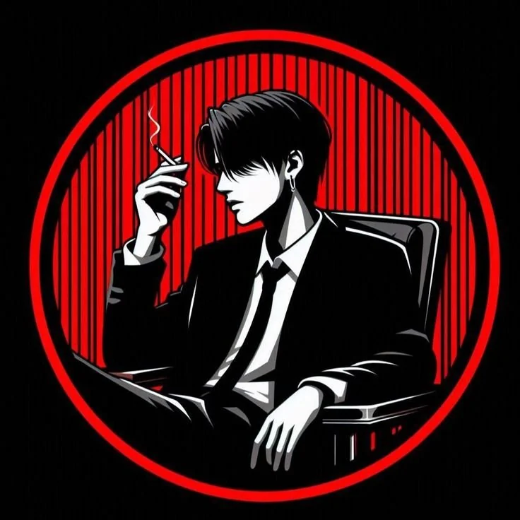
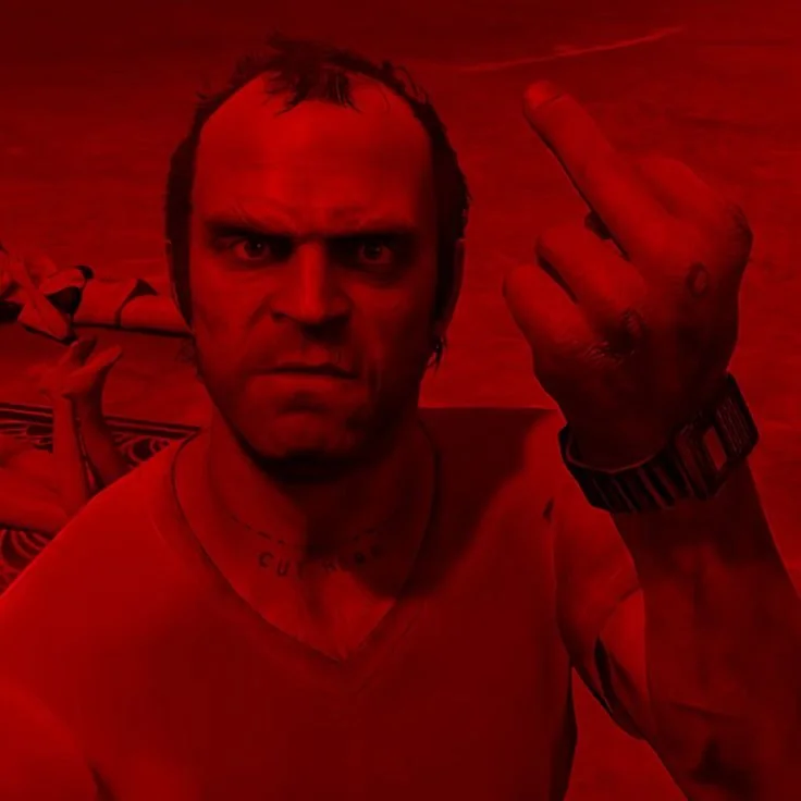
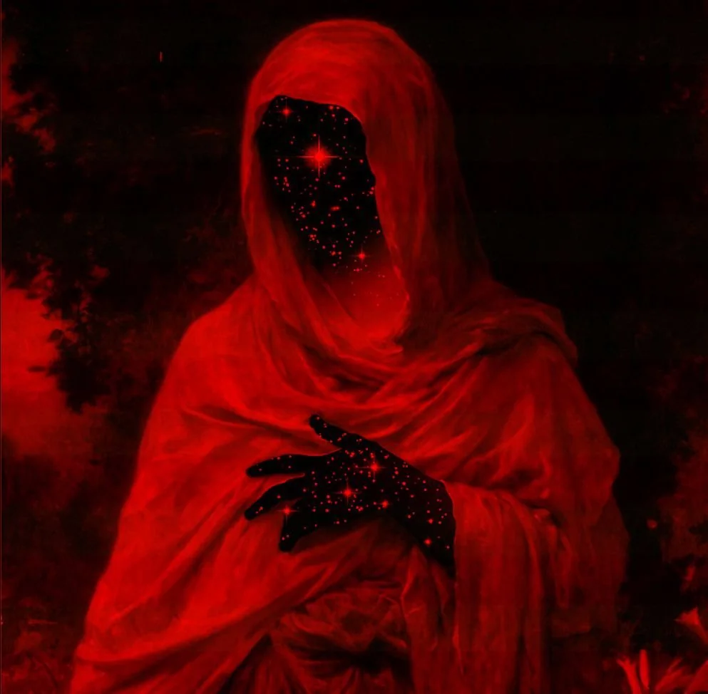
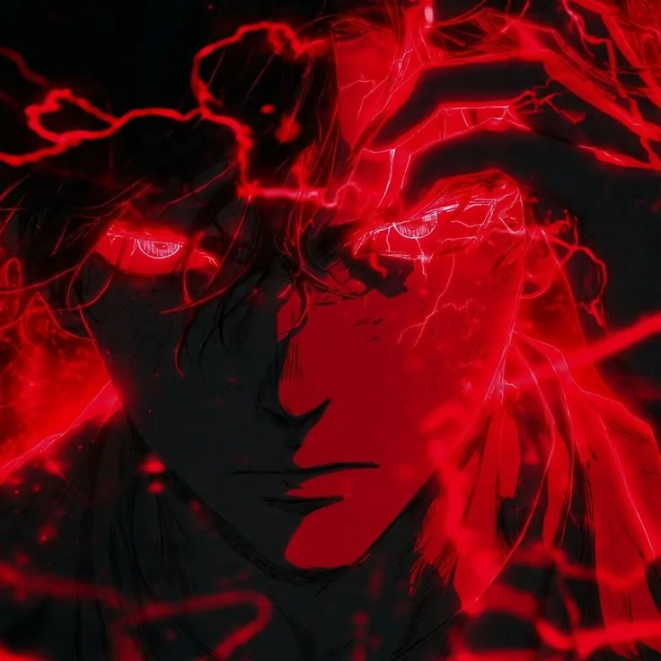
Browse the full gallery below — tap any image to view it full size, then save it as your profile picture.
















Frequently Asked Questions
Why are red PFPs so popular?
Red is the most visible color in a feed, and it reads as confident at any size. A red avatar stands out in a server list or comment thread without needing a busy design. It also pairs well with dark themes, which most social apps use.
What shades work best in a red aesthetic PFP?
Crimson and scarlet carry the look, with black or charcoal grounding them. Mixing two or three reds — a deep burgundy, a bright scarlet, a neon edge — keeps the image rich instead of flat. Avoid using one flat red across the whole frame, which reads as a solid block at small sizes.
Are red PFPs good for Discord?
Yes. High-contrast red stays readable in small circular avatars, and dark red fits naturally with Discord's interface. Pick an image where the face or focal point is brighter than the background, so it does not sink into the server's dark theme.
How can I make my red PFP look more aesthetic?
Soften the light and add grain or a subtle blur, then grade the color so the reds feel intentional rather than accidental. Rainy city scenes, neon signs, and candlelit portraits all photograph red well. The goal is mood, not saturation: a muted crimson often reads as more stylish than a bright one.
Do cute red PFPs still look bold?
Yes, because the color keeps its energy even when the mood softens. Pastel pink, hearts, and flowers make the image warm and welcoming, but the red underneath still catches the eye. The result feels friendly rather than fierce, which suits casual profiles.